The Challenge
Design teams often begin with a photograph, campaign reference, or mood board but still have to sample colors manually, identify the tones that matter, and decide which colors can work together. That turns a visual decision into a repetitive handoff between design judgment and tooling. The brief for this prototype was to make the first pass faster: identify dominant colors in an image and return a palette that could guide branding, layouts, or further creative work. The prototype brief does not document a reproducible time-saving benchmark, harmony-quality evaluation, or user-adoption study.
Our Solution
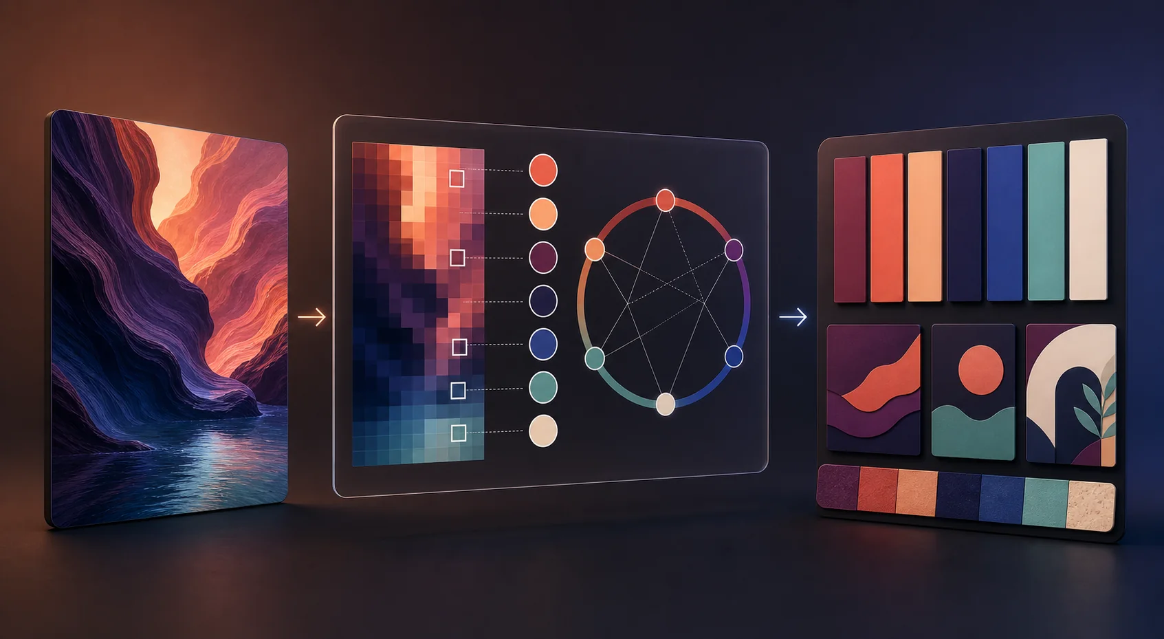
Sketric developed an image-analysis prototype that accepts a source image, extracts its dominant colors, and assembles them into a coherent palette with color-theory guidance. Python and image-processing components handled the analysis, while the design logic translated sampled tones into related colors instead of presenting a raw list of pixels. The result was a focused color palette extraction flow: start with visual material, inspect the colors the system surfaced, and use the generated palette as a starting point for a design decision. It should be understood as a documented prototype capability, not a production performance claim.
From Input to Outcome
Start with a visual reference
A designer begins with a photograph, campaign reference, or mood board that already carries the intended visual direction.
Prepare the image for analysis
The prototype processes the source image so color information can be inspected consistently rather than sampled ad hoc by hand.
Find dominant color candidates
The image-processing stage surfaces the colors that carry the most visual weight instead of returning every pixel as a separate option.
Group the result into a palette
Candidate colors are reduced into a compact, reviewable swatch set that a design team can compare with the source image.
Generate harmony suggestions
Color-theory relationships extend the extracted tones into related combinations so the output can support more than exact color sampling.
Review and apply the palette
The designer keeps, adjusts, or discards the suggestions and uses the selected palette as a starting point for branding, layouts, or creative direction.
How It Works
The workflow starts with a photograph, campaign reference, or mood board. The prototype prepares the image, identifies dominant-color candidates, groups close variations into a compact swatch set, and applies color-theory relationships to suggest related combinations. A designer can compare the output with the source, keep or adjust the useful colors, and carry the palette into branding, layout, or campaign exploration. The project record does not document supported image types, production batch volume, or repeatable performance tests.
Key Features & Capabilities
Accept a source image as the starting point for palette analysis
Extract dominant colors instead of requiring manual pixel sampling
Reduce repeated colors into a compact, reviewable swatch set
Apply color-theory relationships to propose harmonious combinations
Keep source colors visible so a designer can compare the palette with the original image
Separate extracted colors from harmony suggestions derived from them
Create a reusable palette starting point for branding, layouts, and creative direction
Keep the result human-reviewable rather than presenting an opaque design decision
A reference image contains more color information than a team can use directly
A photograph or mood board can contain a large number of related tones, reflections, shadows, and small accents. The design problem is not simply finding a color; it is deciding which colors carry the visual identity and which can be used together. The prototype made that first reduction explicit instead of leaving every designer to repeat the same manual sampling exercise.
Automation supports creative direction instead of replacing it
The useful handoff is a reviewable palette, not an opaque recommendation. By surfacing dominant colors and keeping the source image in view, the workflow gives a designer something concrete to accept, refine, or reject. The brief stays focused on shortening the path to a good starting point rather than claiming that a tool can define the final brand direction.
Observed colors and suggested colors play different roles
A sampled color is evidence from the source image; a harmony suggestion is a design extension built around that evidence. Keeping those roles distinct helps a team understand what came from the reference and what was proposed to make the palette more complete. It also makes the output easier to explain in a design review.
The designer remains responsible for how the palette is used
Color relationships that look coherent in a source image may not work equally well for text, accessibility, print, product UI, or a complete identity system. The prototype therefore works best as an exploration aid. The final choice still belongs to the person who understands the audience, medium, contrast requirements, and brand context.
The workflow is documented more clearly than its production performance
The available record supports the story of an image-to-palette prototype and names its technology groups. It does not provide a reproducible speed test, a defined harmony-quality rubric, a representative image set, a production-volume target, or an adoption study. The page keeps those claims separate so the prototype is useful without overstating what was measured.
A production version needs a repeatable color-quality evaluation
The next phase would compare extracted palettes with designer-created references across different image types and visual styles. It should measure processing time, palette stability, useful-color recall, harmony acceptance, contrast checks, and revision effort, while also documenting rights for the source images. That evidence would show where automation helps and where expert review remains essential.
Tech Stack
Analysis layer: Python-based image processing for inspecting source-image color information
Color extraction: dominant-color analysis and grouping into a compact palette
Design logic: color-theory relationships used to suggest related and harmonious combinations
Prototype output: reviewable swatches intended for further branding, layout, and creative exploration
Evidence boundary: project documentation does not identify a production hosting layer or repeatable benchmark suite
Real-World Impact
The documented outcome is a prototype workflow that moves from a source image to dominant-color swatches and harmony-oriented palette suggestions. That gives a design team a clearer starting point for exploration, but the project documentation does not establish production adoption, a measured reduction in design time, a validated harmony score, or commercial impact.
Project FAQs
What does color palette extraction do?
It turns a source image into a compact set of dominant-color swatches and related harmony suggestions. A designer can review that set and use it as a starting point for branding, layouts, or creative direction.
What kind of input does the prototype use?
The documented workflow starts with an image such as a photograph, campaign reference, or mood board. Project documentation does not define a production file-size, format, or batch-volume contract.
How are dominant colors different from sampling every pixel?
Dominant-color analysis aims to reduce a complex image into the tones that carry the most visual weight. That gives the designer a shorter list to review instead of a noisy collection of every slight pixel variation.
Does the system only return colors already present in the image?
The workflow begins with extracted colors, then applies color-theory relationships to suggest harmonious combinations. That means the final palette can include related suggestions in addition to direct samples from the source.
Does it replace a designer's creative judgment?
No. The intended role is to make the first pass faster and more reviewable. A designer still decides which colors fit the brief, how they should be used, and whether the resulting palette works across the intended brand or layout.
What technologies were used?
The project profile lists Python, computer vision, color theory, AI, and image processing. The case study intentionally describes the capability at that level because the project documentation does not identify a complete production architecture or named algorithm set.
What performance evidence is available?
Project documentation does not include a reproducible timing study, harmony-quality benchmark, image-set evaluation, or adoption record. The result should therefore be read as a documented prototype workflow rather than a measured production outcome.
Is this color palette generator ready for production use?
Production readiness is not established. A next phase would need rights-cleared image sets, defined output-quality criteria, repeatable performance tests, failure-case review, and feedback from the design teams who would use the palettes.
Explore the services behind this work
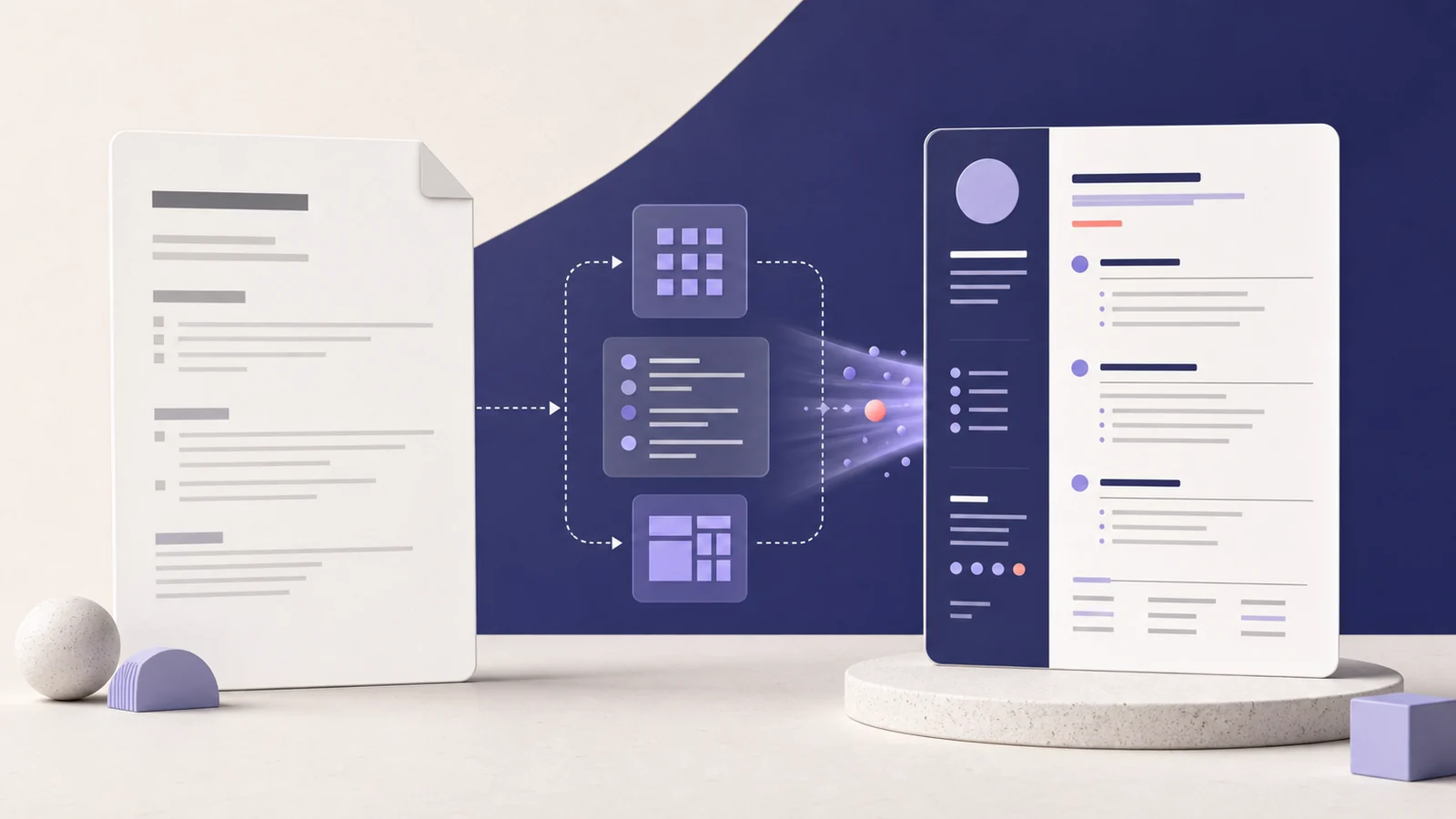
Color CV - Smart Resume Builder
See how Color CV combined AI-assisted resume writing with template-driven design to turn candidate details into polished, structured CV documents without starting from a blank page.
Read case study →
Automated AR with OpenCV
Advanced augmented reality pipeline enabling seamless integration of virtual objects into real-world environments using computer vision.
Read case study →
Vergo AI Assistant
Vergo AI Assistant turns work video into pose landmarks, time-coded REBA signals, and a human review path for ergonomic screening without claiming medical diagnosis or validated accuracy.
Read case study →Have a project with similar engineering constraints?
Tell us what must be built, measured, integrated, and released. We’ll help define the technical path and the evidence needed to support production claims.